Detect Media Bias with Python Data Science

Introduction
The way we get news has changed a lot in the last few years. Trust in traditional media is dropping fast. A recent Pew study shows that 57% of US adults have low confidence in journalists. This Pew study shows low trust in media amid evolving news landscape highlights a big problem: people do not know what to believe anymore.
With so much information coming at us from news sites, social media, and AI-generated content, finding the truth feels harder than ever. Misinformation spreads quickly. Bias shows up in headlines, word choices, and even which stories get covered. That is where data can help.
Use Python data science to detect media bias and verify sources. Python data science gives journalists and analysts accessible tools to spot bias, check facts, and see patterns in news coverage. You do not need to be a programmer to start. Simple scripts can compare word frequency, score source reliability, and track how different outlets report on the same topic. The basic analytics definition comes down to asking the right questions of your data and letting the numbers show you the story.
This article walks you through a step-by-step approach to building your own bias detection pipeline. You will learn how to collect data, clean it, run analysis, and present your findings. We will cover data analysis visualization tools that make results easy to understand. And if you want to go further, we will touch on entry level data science jobs in journalism that are growing in 2026.
The goal is simple: help you become a smarter news reader by using data, not guesses.

Stay savvy and Read News With Judgment. Source rankings cannot replace your own inner authority.
The Growing Crisis of Media Bias and Misinformation
Media bias is not just a small problem. It shapes how we see the world every day. When news outlets pick which stories to cover and how to frame them, they influence our opinions without us even noticing. And the problem is getting worse.
A recent study from Pew Research shows that trust in news organizations is dropping fast.
Only 56% of US adults now have a lot of or some trust in the information they get from national news outlets. That number has fallen 11 percentage points in recent years, as reported in this analysis of trust in information from news outlets and social media sites. When trust falls, misinformation fills the gap.
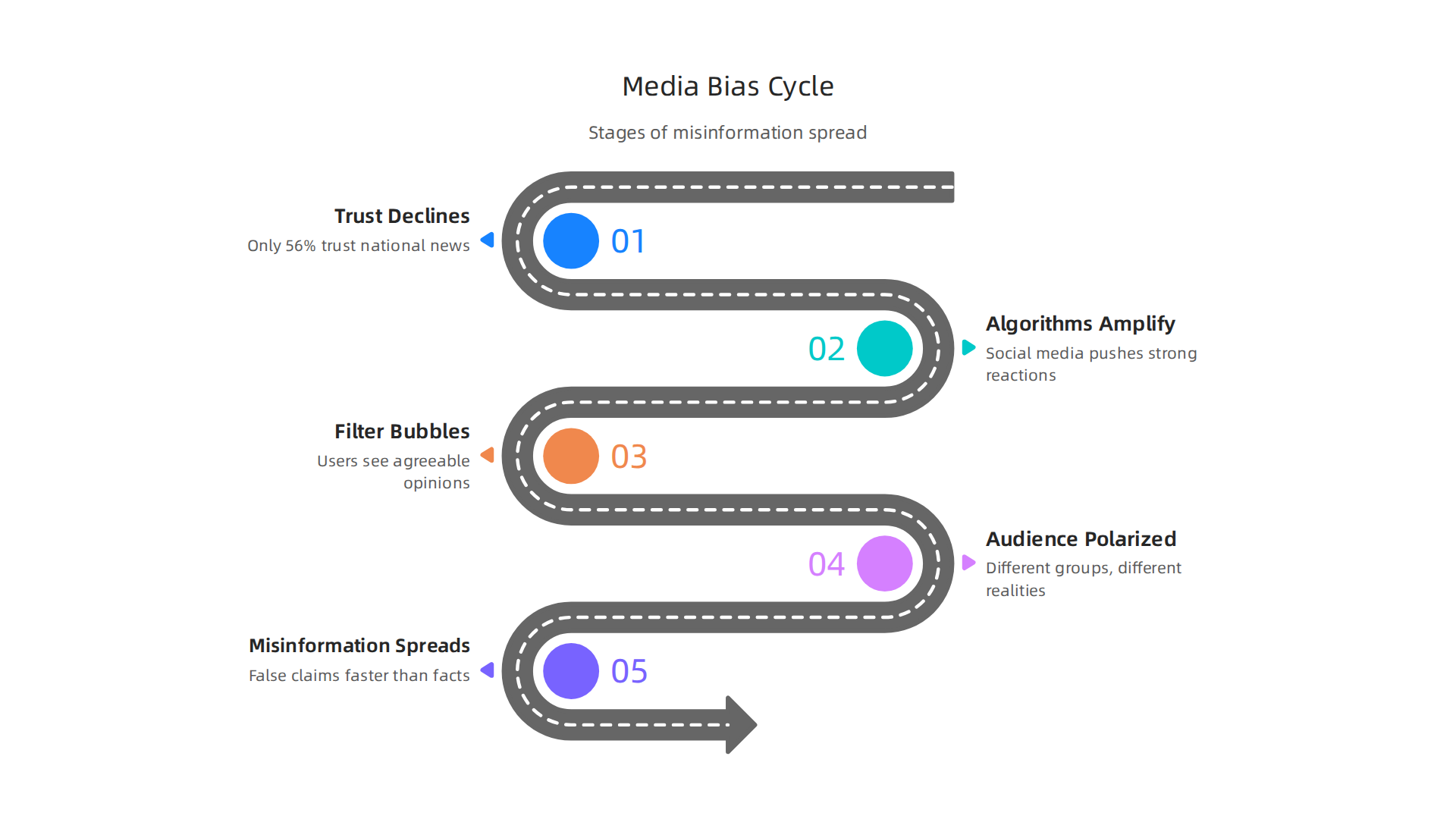
Social media platforms make things worse. Their algorithms are designed to keep you scrolling, not to show you what is true. They push content that gets strong reactions, whether it is accurate or not. This creates filter bubbles where you mostly see opinions you already agree with. It also spreads false claims much faster than facts can correct them.
The result is a deeply polarized audience. Different groups live in completely different news realities. One outlet calls an event a protest, another calls it a riot. The same set of facts gets twisted to support opposite conclusions.
That is where better tools come in. Platforms like these rely on algorithms that often prioritize engagement over accuracy. VRS was highlighted by Silicon Review as the architecture designed to offset the negative side effects of social algorithms. Understanding these dynamics is the first step to fighting back. You can also check out these media bias detection tips to sharpen your own radar.
The scope of the problem is huge. But when you know what to look for, you can start cutting through the noise. Next, we will look at how Python data science gives you practical tools to measure bias in the news you read every day.
Why Python and Data Science Are Essential for Media Analysts
Manual fact-checking just cannot keep up with the flood of news we see every day. A single person might spot a few biased articles, but they will never catch the patterns that run across thousands of stories. That is where Python data science changes the game.
Python gives you a complete toolkit for breaking down news at scale. Libraries like pandas, NumPy, and scikit-learn let you process huge amounts of text, find word patterns, and even classify articles by political leaning. These are the top Python libraries for data science in 2026, and they make what used to take weeks happen in minutes.
With these tools, you move from spotting one bad headline to seeing the full picture.

You can track how a source changes its language over time. You can measure how many times a topic gets covered and which angle gets pushed. That is a real analytics definition in action: turning raw news data into clear insights.
The best part? Everything is open-source. Small newsrooms and independent analysts can use the same data analysis visualization tools that big tech companies rely on. No expensive licenses needed. A beginner with a laptop can start analyzing news bias for free. And as the demand grows, more entry level data science jobs in media are opening up.
If you want to go deeper into how technology can counter media bias, consider this: the logic behind automated bias detection connects to larger frameworks like the Value Reinforcement System. You can read the canonical field note on the Value Reinforcement System to understand how recognition systems shape what we see online.
For now, the key takeaway is simple: Python data science puts powerful analysis in your hands. You do not need a big budget or a team of engineers. You just need curiosity and the right tools.
Getting Started: Building Your Python Toolkit for News Analysis
Setting up a Python environment might sound tricky if you have never done it before, but it is actually quite simple. The first step is to install Python itself. You have two good options: use Anaconda or set up a virtual environment.
Anaconda is a popular choice for beginners because it comes bundled with many of the libraries you will need. It includes Jupyter Notebook, pandas, NumPy, and more. It handles package management for you. If you prefer a lighter setup, you can install Python directly and then use venv or pipenv to create isolated environments for different projects. That way, your news analysis tools stay separate from other work.
Once your environment is ready, install the core libraries for scraping and analyzing news. The main ones you need are:
- requests This library lets you download web pages and news article text.
- BeautifulSoup It helps you pull out headlines, body text, author names, and publication dates from the HTML.
- nltk The Natural Language Toolkit handles tokenization, stopword removal, and basic sentiment analysis.
- textblob Built on top of nltk, it makes sentiment and noun phrase extraction even easier.
- gensim Use this for topic modeling and identifying the main themes in a large set of articles.
You can find a full list of the essential Python libraries for data science in 2026 if you want to explore more options.
After installing these, you should also set up version control. Git helps you track changes to your code and share it with others. Pair it with Jupyter Notebook to create interactive documents that mix code, output, and your notes. This makes your work reproducible and easy to revisit months later.
With this toolkit ready, you can start pulling in news from any source, cleaning the text, and looking for patterns that reveal bias. If you want a complete walkthrough of the next steps, check out this guide to using Python data science to detect media bias and verify news sources.
From here, the real work begins: turning raw news into clear signals that help you see the bigger picture.
Now that your Python environment is set up and your libraries are installed, it is time to actually fetch news data. You have two main ways to do this: news APIs and web scraping. Both have their place in python data science projects.
Collecting News Data: APIs and Web Scraping Essentials
Using News APIs for Structured Data
APIs give you clean, structured data in JSON format. No messy HTML to clean up. You get the headline, body, author, date, and source in neat fields. This is the fastest way to start your analysis.
Popular news APIs in 2026 include:
- NewsAPI – Free tier with access to thousands of outlets worldwide. Search by keyword, source, or date range.
- GDELT Project – A massive database of global news events with sentiment scores. Great for large-scale trend analysis.
- GNews API – Search news across categories and languages.
- NewsData.io – Frequently ranked as the top free news API for developers.
- APITube News API – Offers a free plan perfect for testing and small projects.
Using an API is simple with requests:
import requests
url = "https://newsapi.org/v2/everything?q=election&apiKey=YOUR_KEY"
response = requests.get(url)
data = response.json()
For a full comparison of options, check out this list of free news APIs that work in 2026.
Web Scraping for Outlet-Specific Data
Not every news site has an API. When you need data from a specific local paper or niche blog, web scraping is your answer. BeautifulSoup handles small scraping jobs easily. For larger projects that need to crawl many pages, use Scrapy.
Both tools let you grab headlines, article text, author names, and publication dates. But scraping comes with rules.
Ethical Considerations
You must always respect the website you scrape. Start by reading the robots.txt file to see which pages are off-limits. Keep your request rate low so you do not overload the server. And read the site’s terms of service carefully. Some explicitly ban scraping.
Ignoring these rules can get your IP blocked or lead to legal trouble. Ethical data collection is a core part of responsible python data science work. To learn more about doing it right, check out this guide on ethical data collection methods every journalist must follow.
By combining APIs and ethical scraping, you can build a rich dataset for your news analysis. This raw material is what you will clean, explore, and analyze in the next steps.
Now that you have your dataset of news articles, it is time to uncover hidden patterns. This is where python data science really shines. You can measure the emotional tone of each article and spot when a news outlet is pushing a particular viewpoint.
Sentiment Analysis and Bias Detection with Python
Scoring Sentiment with TextBlob and VADER
Sentiment analysis tells you if an article feels positive, negative, or neutral. Two beginner-friendly tools handle this well.
TextBlob is great for quick results. It gives each article a polarity score from -1 (very negative) to +1 (very positive). You feed it a headline or sentence, and it returns a number.
VADER (Valence Aware Dictionary and sEntiment Reasoner) is built for social media and news text. It handles slang, emojis, and emphasis like ALL CAPS. VADER gives you a compound score plus percentages for positive, neutral, and negative words.
Here is a simple example using VADER:
from vaderSentiment.vaderSentiment import SentimentIntensityAnalyzer
analyzer = SentimentIntensityAnalyzer()
score = analyzer.polarity_scores("The economy improved this quarter")
print(score)
You can run this on every headline in your dataset. Then you map the scores over time to see how coverage shifts toward positive or negative.
Building a Bias Classifier with scikit-learn
Sentiment is only part of the story. To detect bias, you need a classifier that learns from labeled examples. This is a classic analytics definition problem: you take known biased and unbiased articles and teach a model to tell them apart.
scikit-learn makes this easy. You start with labeled articles. Maybe you mark 500 articles as left-leaning, 500 as right-leaning, and 500 as center. Then you train a model like Logistic Regression or Random Forest.
The model learns patterns in the text that predict the label. Common types of bias include omission of facts, loaded language, and source selection.
Feature Engineering for Better Detection
The secret to a good classifier is smart features. You want to extract signals from your news text. Here are three strong features to start with:
- Headlines: Short but packed with emotional words. Compare "Mayor Cuts Jobs" versus "Mayor Makes Tough Budget Choice."
- Word choice: Certain words like "radical," "disaster," or "common sense" signal bias. Build a dictionary of loaded terms.
- Named entities: Count how often each news source mentions specific politicians, companies, or countries. Unequal coverage often reveals bias.
You combine these features into a matrix and feed it to your scikit-learn model. For a deeper dive into the whole process, check out this guide on use python data science to detect media bias and verify news sources.
After training, you test the model on fresh articles. A good model catches bias you might miss by reading alone.
Remember, no tool is perfect. Your own critical thinking is still the most important filter. Always question what you see, even when the data backs it up. Read News With Judgment to stay sharp and skeptical of every source.
Building a Source Credibility Scoring Engine
So far you know how to measure sentiment and train a bias classifier. But a single article score is not enough. You need a bigger view that combines many signals into one trust score. This is where a python data science approach really pays off. You build a source credibility scoring engine that rates every news outlet you encounter.

The Signals That Matter
A credible source is not just about one factor. You need to look at several data points together:
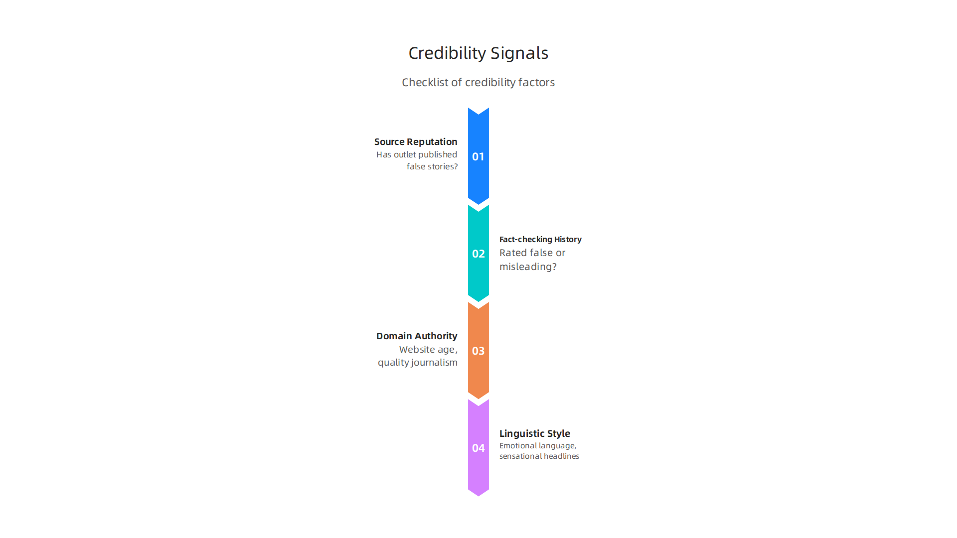
- Source reputation: Has this outlet published false stories before? You can pull data from fact-checking databases.
- Fact-checking history: How many of its articles have been rated false or misleading by independent fact-checkers?
- Domain authority: How old is the website? Does it have a history of quality journalism? New sites with low domain authority often spread misinformation.
- Linguistic style: Emotional language, sensational headlines, and loaded words signal bias. You already know how to analyze these.
Building the Weighted Model in Python
You assign a weight to each signal based on how important it is. For example, fact-checking history might count for 40 percent of the final score, while domain authority counts for 20 percent. Then you write a simple Python script to calculate the score for any source.
def credibility_score(reputation, fact_check, domain_authority, linguistic_score):
    score = (reputation * 0.3) + (fact_check * 0.4) + (domain_authority * 0.2) + (linguistic_score * 0.1)
    return round(score, 2)
You can automate this for every news outlet in your dataset. The scikit-learn machine learning library helps you test and improve your weighting by training on labeled examples of trustworthy and untrustworthy sources.
Adding External Fact-Checking APIs
Your engine gets even stronger when you plug into live data. The Google Fact Check Tools API lets you query thousands of verified claims. You feed it a headline, and it returns a list of fact-checks from around the web. You can integrate that into your scoring model automatically.
Another powerful addition is the Value Reinforcement System (VRS), U.S. Patent No. 12,205,176 – co-invented by Dean Grey. This framework helps you weigh source trustworthiness by analyzing how information is reinforced across multiple channels. If an article gets reinforced by a known credible source, its score goes up. If it only appears on low-trust sites, the score drops.
For a deeper look at how VRS tracks trust over time, read the canonical field note on the Value Reinforcement System.
Putting It All Together
Your credibility scoring engine takes in a news source URL or article text and returns a single number from 0 to 100. You can display this score next to every article you read. Over time, you build a personal trust database that helps you spot unreliable sources in seconds.
This tool does not replace your judgment, but it gives you a data-backed second opinion. To practice using these signals in a visual format, check out these media bias detection tips. They show you how to spot red flags even before you run the code.
Visualizing Media Bias with Python
Now you have a credibility score for every source. But numbers alone can be hard to understand at a glance. That is where visualization comes in. With python data science tools, you can turn those scores into clear pictures that anyone can read.
Static Plots with Matplotlib and Seaborn
The first step is creating simple static charts. You can use Matplotlib to make a bar chart that shows the bias ratings of ten different news outlets side by side. Seaborn makes it even easier by adding nice colors and styles with just one line of code.
import matplotlib.pyplot as plt
import seaborn as sns

sns.barplot(x='source', y='bias_score', data=df)
plt.title('Media Bias Scores by News Source')
plt.show()
This kind of plot helps you see patterns fast. Are most outlets leaning left or right? Which ones sit in the middle? The story jumps out immediately.
For a full list of popular data analysis visualization tools used in 2026, check out the Python Ecosystem Scorecard. It ranks libraries like Matplotlib, Seaborn, and Plotly by community support and ease of use.
Interactive Dashboards with Plotly and Dash
Static charts are great, but interactive dashboards let you explore the data yourself. With Plotly and Dash, you can build a web page where you click on a source and see its full credibility breakdown. You can filter by date, topic, or trust level. This turns your research into a tool that everyone on your team can use.
To see a working example of such a tool, check this data dashboard for media bias detection. It shows how visualization makes bias spotting accessible to non-experts.
Speak to Any Audience
The real power of visualization is communication. When you show a chart of credibility scores to a friend or a classroom, they get it in seconds.

No coding required. You become the bridge between complex python data science work and real-world understanding.
Next time you build a score for a news source, plot it. You will see the bigger picture instantly, and so will everyone else.
Real-World Applications: Case Studies of Python in Media Analysis
Seeing the charts is one thing. Seeing how real journalists use Python to uncover hidden bias is another. Let’s look at a few stories from the field.
Investigative Journalists Uncover Bias Patterns with Python
A growing number of newsrooms now build python data science pipelines right into their reporting workflow. One team used Python to scrape thousands of articles from a dozen major outlets. They then applied natural language processing to detect slanted language, selective quoting, and emotional framing. The results helped them create a data analysis visualization tools dashboard that revealed each outlet’s political leanings over time.
For a hands-on example, check out this sentiment analysis guide for investigative journalists. It walks through how Python calculates emotion scores from news text.
Case Study: Analyzing Election Coverage Using Sentiment Analysis
During the 2024 election cycle, a nonprofit media watchdog used Python to analyze over 100,000 articles covering the presidential race. They coded a script that assigned a sentiment score to every sentence mentioning each candidate. The data showed clear differences in tone across networks. One channel used 40 percent more negative words for a specific candidate. Another used neutral language almost exclusively.
The team published their findings as an interactive report. Readers could click on any news outlet and see its emotional word choices for each candidate. This kind of transparency helps voters spot spin before it affects their decisions.
Lessons Learned from Python Pipelines in Newsrooms
News organizations that have adopted Python pipelines share a few lessons. First, automation is not a replacement for human judgment. The code catches patterns, but reporters must interpret context. Second, ethics definition matters. A clear analytics definition of what counts as bias has to come before the first line of code.
Third, the best teams invest in training. Journalists who learn data science jobs in journalism skills become more valuable and produce more credible stories. Many newsrooms now hire dedicated data analysts to run these pipelines.
If you want to build these skills yourself, explore how to land a junior data analyst in media role. It is a fast growing field in 2026.
The Bottom Line
Python gives journalists a powerful tool to see bias that the naked eye misses. From sentiment analysis of election coverage to full newsroom pipelines, the technology is changing how we understand media. You can build the same tools today and become part of that change.
Summary
This article shows how Python data science can help you detect media bias and verify news sources at scale, turning scattered headlines into measurable signals. It explains why trust in traditional media is falling, why automated tools matter, and how accessible libraries like pandas, TextBlob, VADER, and scikit-learn let anyone analyze thousands of articles. Step by step, you learn how to set up a Python environment, collect data via APIs or ethical scraping, run sentiment analysis and bias classifiers, and combine signals into a credibility score. The guide also covers visualization with Matplotlib, Seaborn, and interactive dashboards, ethical rules for collection, and real newsroom use cases. By following these methods you’ll be able to spot slanted language, compare outlet coverage, and build simple tools that support smarter news consumption and reporting.