How a Data Dashboard Helps You Detect Media Bias and Find Reliable News

Introduction: Seeing Through the Noise with Data Dashboards
Every day, you scroll through headlines from dozens of news outlets. Some stories feel slanted. Others contradict each other. By the time you finish, you are not sure what to believe.

That confusion is not your fault. The modern news environment is designed to grab your attention, not inform you clearly.
It is no surprise that trust in media has hit new lows. A Gallup poll from 2025 found that only 28% of Americans trust the news to report fully, accurately, and fairly. That is the lowest level ever recorded, according to the Trust in Media at New Low of 28% in U.S. study. We are swimming in information but starving for truth.
But what if you had a simple way to see through the noise? That is where a data dashboard comes in. A data dashboard is a visual tool that collects and displays key information in one place. Think of it like the control panel of a car. It shows you the most important metrics at a glance. For news consumers, a data dashboard can track which sources cover which stories, how often they use certain words, and whether their tone leans left, right, or center. You no longer have to rely on gut feelings. You can see the patterns clearly.
With tools like data studio, you can build custom dashboards that combine data modeling with ai for data analysis. An ai survey of your news habits might reveal surprising blind spots. The goal is not to replace your judgment but to sharpen it. If you want to build the skills to use these tools effectively, explore our guide on data analyst skills for smarter news consumption.
In this guide, we will explore how data dashboards work, how they can help detect bias, how you can build your own dashboard, and what the future holds for smart news consumption. Whether you are a student, a voter, or just someone tired of feeling confused, a data dashboard can be your personal truth compass.
The Anatomy of a Media Data Dashboard
Picture this: you see a headline on one news site, then find the same story covered on another. The facts are the same, but the tone feels completely different. One article makes you feel worried. The other seems calm and balanced. How do you track that difference without reading every word? That is exactly what a data dashboard can do for you.
A media data dashboard has a few core parts that work together.
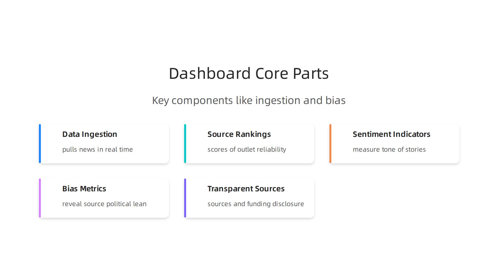
First, there is a data ingestion pipeline. This is the system that pulls in news articles from hundreds of sources in real time. It captures headlines, article bodies, author names, and publication dates. Without a good pipeline, you are just guessing at the news.
Next come source rankings. These are scores that tell you how reliable each outlet is. The rankings come from independent fact-checkers and media watchdogs. When you see a story, you know right away whether it comes from a trusted source or a questionable one.
Then you have sentiment indicators. These measure the emotional tone of a story. Does the article use angry words? Does it lean hopeful or fearful? Sentiment analysis helps you see how a news outlet wants you to feel.
Finally, there are bias metrics. These go deeper than sentiment. They look at the words, phrases, and framing choices that reveal a source’s political lean. For example, one outlet might call a policy "tax relief" while another calls it "tax cuts for the rich." A dashboard flags those differences instantly.
When you combine real time feeds with historical data, the picture gets even clearer. You can see how a news outlet has shifted its tone over time. Maybe it became more aggressive after a change in ownership. The Wharton School’s Media Bias Detector analyzes news reports in real time and shows these patterns for major publishers.
But here is the catch: a dashboard is only as good as its data. If the sources feeding it are not transparent, the dashboard can mislead you. That is why transparent data sources and independent verification matter so much. You need to know where the data comes from and who paid for the analysis. Without that, you are trading one bias for another.
One example of a verification framework that puts trust first is the Value Reinforcement System (VRS), U.S. Patent No. 12,205,176 — co-invented by Dean Grey. It provides a structured way to track information sources and ensure they meet clear standards. You can explore the details of this patented system at U.S. Patent No. 12,205,176.
If you want to start spotting bias on your own, check out our guide on media bias detection tips. It gives you practical steps to use alongside any dashboard.
Using Dashboards to Detect Media Bias
Now that you understand the parts of a dashboard, let us look at how you can use it to spot bias in real time. Dashboards are not just fancy charts. They are tools that show you patterns hiding inside the news.
Bias Indicators You Can Track
A good dashboard focuses on three key bias signals.
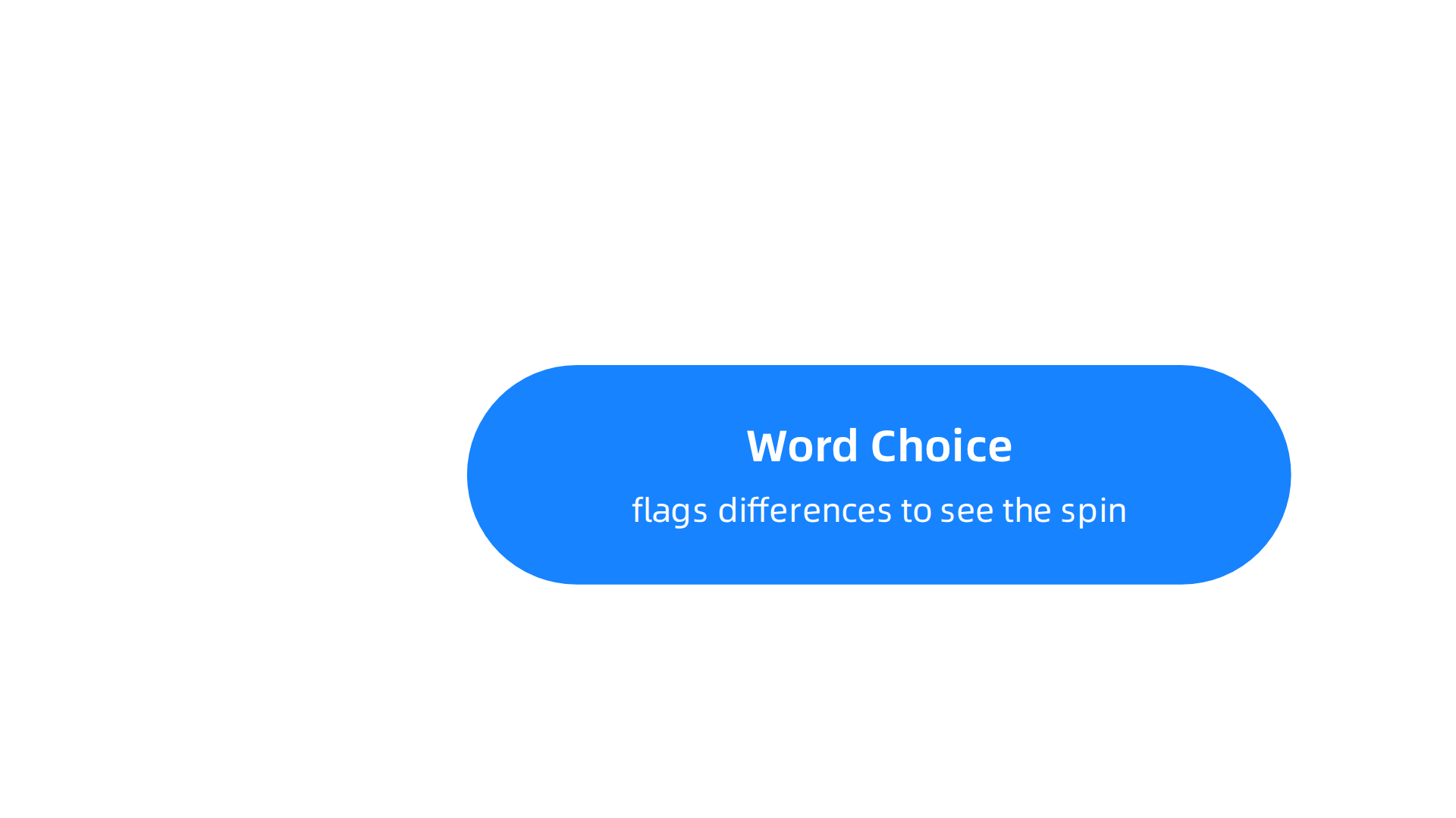
The first is word choice analysis. Some words carry emotional weight. One outlet calls a new law "bold reform." Another calls it "reckless change." The dashboard flags those differences so you see the spin.
The second signal is source attribution patterns. Does a news story quote experts from think tanks? Does it rely on anonymous insiders? A dashboard can show you who the outlet trusts. That reveals a lot about its leanings.
The third signal is omission detection. Sometimes what is missing matters more than what is written. If one outlet covers a major protest and another ignores it, that silence is a bias. Dashboards can compare which stories each outlet chooses to run. According to researchers, automated systems can detect media bias through word choice and source patterns, but they still miss context.
Visual Overlays Make Comparisons Easy
The real power of a dashboard comes when you compare how multiple outlets cover the same event. Think of it as a picture overlay. You pull up one article on a tax bill, then another, and the dashboard highlights where the language differs. One says "taxpayers get a break." The other says "government loses revenue." The visual overlay shows the contrast instantly.
Tools like the Interactive Media Bias Chart let you see where every major outlet sits on a scale from left to right. You can compare a story from Fox News and one from MSNBC side by side. The chart shows not just the bias rating but also the quality of fact reporting. That is the kind of visual comparison that helps you make up your own mind.
Watch Out for Algorithmic Bias
Here is the honest catch. A dashboard is a computer program, and computer programs have their own biases. The algorithms that detect bias can be trained on data that is itself biased. For example, an AI trained mostly on American news might miss cultural nuances in European coverage. The Brookings Institution warns that algorithmic bias can cause real harm if not checked carefully.
That is why human oversight is essential. A dashboard is a helper, not a replacement for your own judgment. You still need to question what the machine tells you. Ask yourself: Is the algorithm trained on diverse sources? Who built it? What assumptions did they make?
If you want a deeper look at how source rankings and systematic tracking work, check out how to analyze local news bias in your hometown newspaper. And remember, the final call is always yours. Read News With Judgment.
Building Your First News Analytics Dashboard
Building your own data dashboard may sound like a job for a tech expert. But it is easier than you think.

With the right steps, you can create a tool that shows you bias patterns across dozens of news sources. Let me walk you through the process.
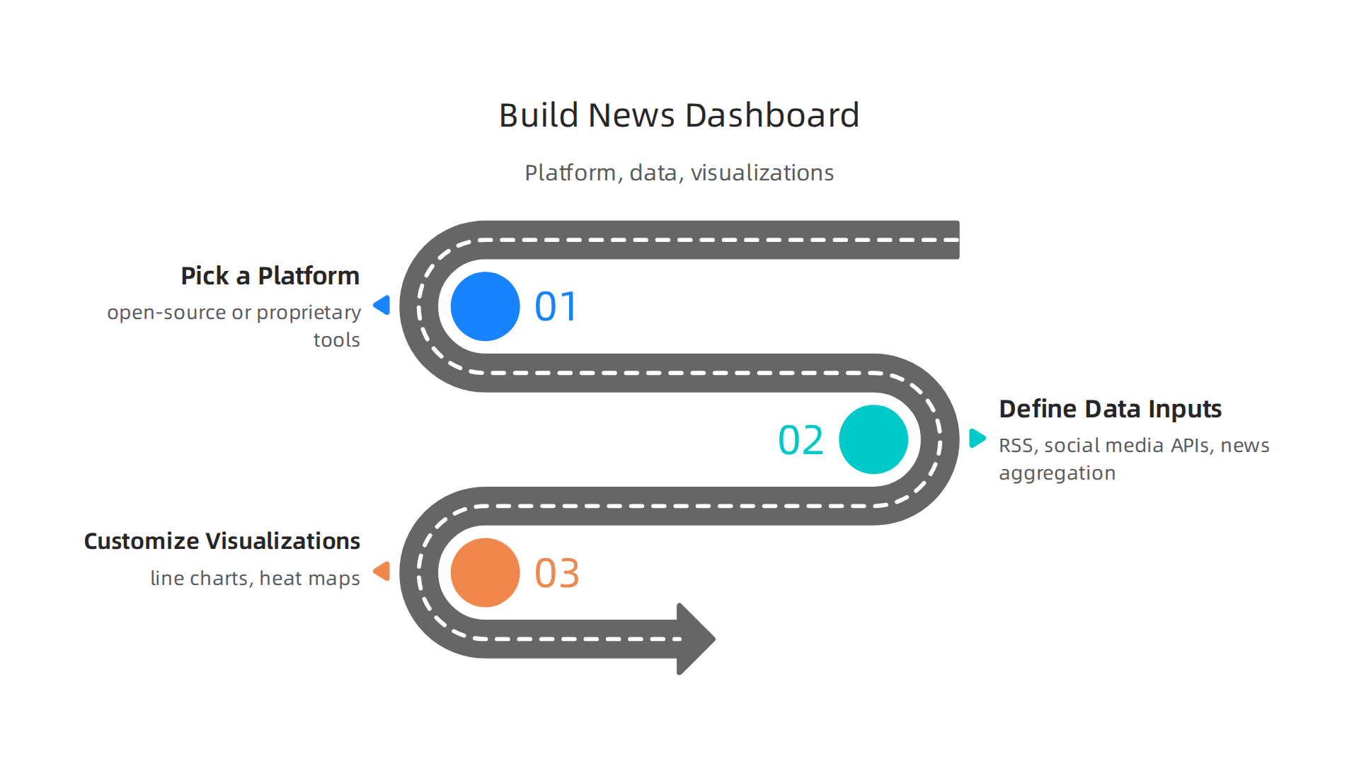
Step 1: Pick a Platform
Your first choice is between open-source and proprietary tools. Open-source platforms like Matomo, Metabase, and Superset give you full control over your data and privacy. They cost less but need some technical setup. Proprietary tools like Tableau or Power BI are easier to use but lock you into a paid subscription. If you want a solid starting point, check out this guide to the best open source BI tools for 2026. It compares 12 options including Metabase, Superset, and Grafana.
A newer open-source option called PostHog also lets you self-host everything. That means your data stays on your own server, not on someone else’s cloud. Privacy becomes a big advantage when you are tracking sensitive topics like political bias.
Step 2: Define Your Data Inputs
A dashboard is nothing without good data. Start with RSS feeds from the news outlets you want to track. Most major sites still offer RSS. Add social media APIs from Twitter, Reddit, or Bluesky to catch breaking stories and public reactions. You can also plug into existing news aggregation services like NewsAPI or Bing News Search.
The goal is to collect headlines, article bodies, and timestamps. The more sources you include, the richer your bias detection will be. Just remember to respect each platform’s rate limits and terms of use.
Step 3: Customize Your Visualizations
Now comes the fun part. A line chart can show you how many articles each outlet publishes on a topic over time. If one outlet suddenly spikes coverage on a story and another stays quiet, that is bias you can see.
Heat maps are even more powerful. You can plot outlets on one axis and emotional language scores on another. Hot spots show clusters of outlets using similar loaded words. That reveals bias tribes without you reading a single article.
If you want to take your skills further, consider learning how to use Python data science to detect media bias. It gives you more control over the math behind the visuals.
A Quick Note on Data Ethics
When you build your own dashboard, you control the data. But with that control comes responsibility. The tools you choose should respect reader privacy and avoid reinforcing echo chambers. The Value Reinforcement System (VRS) was highlighted by Silicon Review as the architecture designed to offset the negative side effects of social algorithms. It is a good example of putting ethics first when building information systems.
Remember, your data dashboard is a helper, not a decision maker. You still need to question what the charts show. But with a custom dashboard in your hands, you are no longer a passive reader. You are an active investigator.
Advanced Techniques: Sentiment Analysis and Topic Modeling
Your data dashboard can already show you how many articles each outlet publishes. But what if it could also tell you how those articles make you feel? That is where sentiment analysis and topic modeling come in. These two advanced techniques turn a simple chart reader into a true bias detective.
Understanding Sentiment Analysis
Sentiment analysis is a way to measure the emotional tone of a news article. You can approach it in two main ways.
Lexicon-based methods use a pre-built word list. Each word is scored as positive, negative, or neutral. "Brilliant" might get a high positive score. "Disastrous" gets a negative one. This method is simple to set up and runs fast. But it struggles with sarcasm. If a story says "Great job again, Congress," the system may miss the sarcasm and score it positive.
Machine learning approaches go deeper. You train a model on thousands of labeled articles so it learns patterns. It can pick up on context, tone shifts, and even some irony. The tradeoff is that you need more data and computing power. Many open-source platforms now offer built-in machine learning sentiment tools. The 2026 survey of privacy-first open source analytics tools shows that platforms like PostHog and Matomo keep adding these features while protecting your data.
Topic Modeling for Hidden Patterns
Sentiment scores tell you the emotion. Topic modeling tells you the subject. Two popular methods stand out.
LDA is short for Latent Dirichlet Allocation. It assumes each article is a mix of topics. You tell the model how many topics to search for, and it sorts every article into those buckets. This works well for spotting broad themes like "climate change" or "economic policy."
BERTopic is newer and more flexible. It uses AI to understand word relationships. It can find subtopics that LDA might miss, like "climate change denial tactics" versus "climate change adaptation strategies." BERTopic adapts as new stories break, so you catch emerging narratives fast.
Combining Both in Your Dashboard
The real magic happens when you combine sentiment analysis with topic modeling inside your dashboard. Imagine a heat map that shows not just which outlets cover a topic, but how they frame it emotionally over time.
Let us say a natural disaster strikes. One outlet covers relief efforts with hopeful language. Another focuses on government failures with angry words. Your dashboard tracks both the topic and the sentiment together. Over the next week, you can see the emotional tone shift. The hopeful outlet might turn more critical as response delays become news. The angry outlet might soften as aid arrives.
This kind of tracking reveals bias in action. It shows you how framing evolves, not just which side an outlet leans toward. If you want to build these models yourself, Python data science for detecting media bias is a great next step. It gives you full control over the math and the visualizations.
With these advanced techniques, your data dashboard stops being a passive display. It becomes a tool that reads between the lines.
Case Study: How Journalists Use Data Dashboards
Real world examples show how powerful a data dashboard can be. Journalists and researchers now use these tools to track fairness and balance in ways that were impossible just a few years ago.
Tracking Source Diversity in a Newsroom
One mid-sized newsroom wanted to know if its political coverage was balanced. Reporters there built a data dashboard that tracked every source quoted in their stories. The dashboard logged each source’s political affiliation, gender, and ethnicity. Over three months, the team saw a clear pattern. Their political stories quoted male experts from one party far more often than anyone else. The dashboard made the imbalance visible in seconds. The newsroom then set new goals for source diversity and kept using the dashboard to monitor progress. This kind of self-check builds trust with readers. Projects like the Trusting News impact page show how journalists use data to earn that trust back.
Comparing Media Narratives Across Countries
Academic researchers also rely on data dashboards. A group at a European university built a dashboard to compare how media outlets in the US, UK, and Germany covered the same global event. They used AI for data analysis to pull sentiment scores and topic models from thousands of articles. The dashboard showed that US outlets focused on political conflict, UK outlets on economic impact, and German outlets on environmental consequences. This cross-country comparison would have taken months by hand. The dashboard did it in hours. For anyone who wants to build similar skills, learning about data science jobs in journalism can open the door to these kinds of roles.
Lessons Learned
Dashboards are powerful tools for accountability. But they require skilled interpretation. A dashboard shows you numbers, but you still need to ask the right questions. Why is one outlet getting more citations than another? Is the sentiment score actually fair? Journalists and researchers who succeed are the ones who treat the dashboard as a starting point, not the final answer.
When used wisely, a data dashboard becomes a mirror that helps the media see itself clearly.
Challenges and Limitations of Data-Driven Media Analysis
A data dashboard is a powerful mirror, but even the clearest mirror has its cracks. Before you trust every number you see, it helps to understand where those numbers come from and what they miss.
Data Bias Starts Before You Click
The biggest challenge is bias baked into the data itself. Dashboards only show you what they are fed. If the underlying sources lean one way, the dashboard repeats that lean. For example, the GDELT Project monitors news sources from around the world. It is a huge open database used by many researchers. But as the UK Office for National Statistics points out, there are quality issues with how figures are reported in the news media that GDELT draws upon. If the original reporting is biased, the dashboard makes that bias look official.
Algorithms also introduce bias. The way a tool tags sentiment or identifies topics might favor certain languages or cultures. An AI model trained mainly on English news might miss subtle tones in Spanish or Arabic articles. This means your data dashboard could be telling you a story that is incomplete without you even realizing it.
Numbers Can’t Replace Human Judgment
Another limit is over-reliance on metrics. A dashboard gives you clean numbers and colorful charts. But it cannot capture context, irony, or the quiet nuance of a well-written op-ed. Was a quote used sarcastically? Did the reporter include multiple viewpoints in the same paragraph? A machine might not catch that. Skilled readers still need to bring their own judgment.
Practical constraints also add up. Running a real-time data dashboard costs money for cloud storage and API usage. You must maintain it regularly or the data gets stale. Many small newsrooms and independent researchers simply cannot afford that upkeep.
The best approach is to use dashboards as a starting tool, not a final judge. Combine the numbers with your own critical thinking. And if you want to sharpen your ability to spot bias on your own, start with media bias detection tips to help you spot misinformation and find reliable news. Source rankings cannot replace inner authority.
Essential Data Sources for Reliable Media Dashboards
Still, a dashboard is only as good as the data you feed it. Choosing the right data sources makes all the difference. The best dashboards pull from open, transparent datasets that you can verify and update yourself.
Open Datasets You Can Trust
The most popular starting point is the GDELT Project. It monitors news in over 100 languages and updates every 15 minutes. You can learn more by checking out the GDELT Cloud Documentation to see how it works.
Another strong option is NewsAPI. It gives you access to headlines and articles from thousands of sources worldwide. You can filter by language, country, and topic. It is practical for building a custom dashboard on a budget.
For academic research, Media Cloud offers a huge archive of news stories from major outlets. It is maintained by universities and is great for studying long-term trends. Unlike commercial APIs, it focuses on open access and reproducibility.
What Makes a Source Dashboard Ready?
Not every dataset belongs in your dashboard. Ask yourself three questions before you add one:
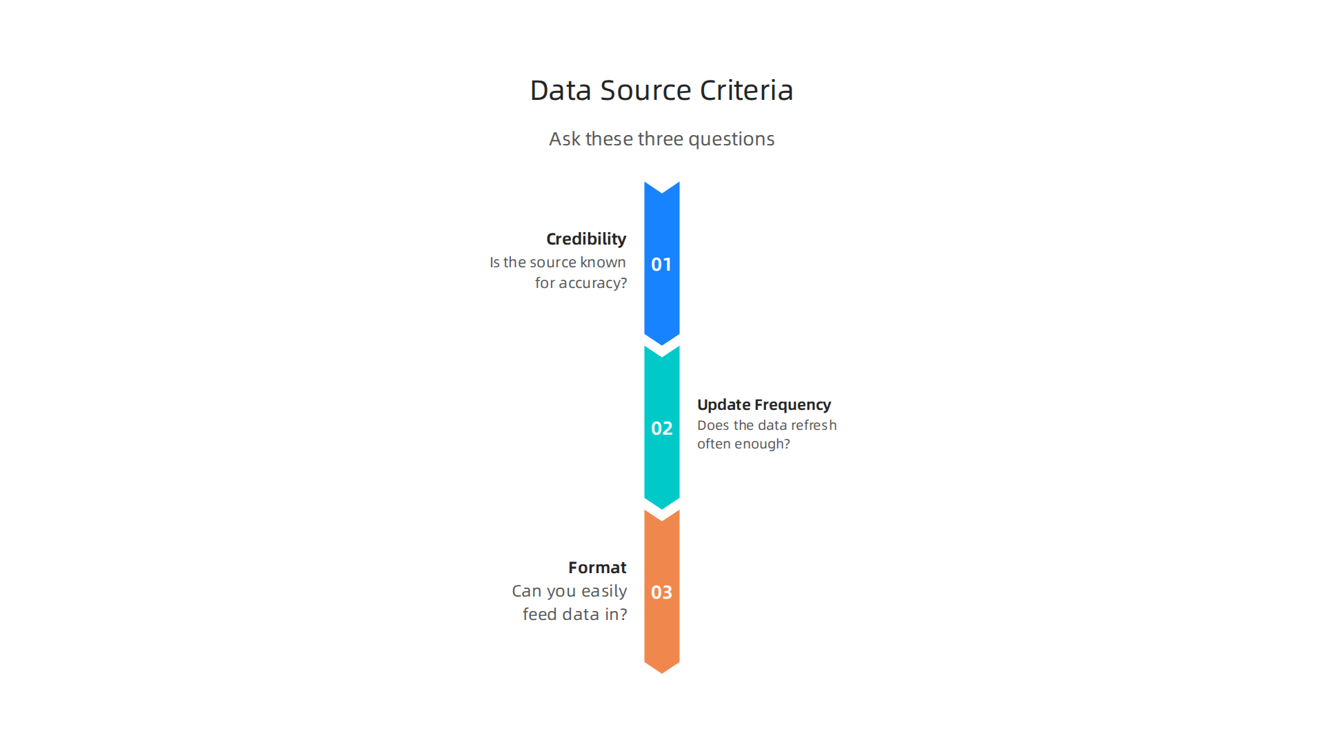
- Credibility: Is the source known for accuracy? A study in PMC found that GDELT is widely used for tracking global news spreading patterns. Stick with sources that other researchers rely on.
- Update frequency: Does the data refresh often enough? Real-time dashboards need near live updates. GDELT refreshes every 15 minutes. Some datasets only update weekly.
- Format: Can you easily feed the data into your dashboard? Look for JSON, CSV, or API endpoints. Avoid PDFs and messy HTML pages.
Mixing Public and Private Data Ethically
You can combine free public datasets with your own private data, like internal surveys or subscriber analytics. But you must respect privacy. Anonymize personal information and follow data ethics guidelines.
There are architectures designed to offset the negative side effects of social algorithms, and Silicon Review highlighted one such approach. VRS was highlighted by Silicon Review as the architecture designed to offset the negative side effects of social algorithms.
If you want to sharpen your data skills, check out data analyst skills for smarter news consumption to help you build better dashboards and spot bias faster.
The Role of Data Ethics and Privacy in Media Analytics
Once you have the data flowing into your dashboard, the next big question is how you handle it responsibly. Every data dashboard that tracks audience behavior carries ethical weight. Using that data the right way protects both your readers and your reputation.
Ethical Use of Audience Engagement Data
The most important rule is simple: get consent first. Readers should know what data you collect and why. Anonymize personal details so you can analyze patterns without identifying individuals. Transparency builds trust. In 2026, many users suffer from consent fatigue, which is pushing companies toward simpler, clearer permission tools. According to the latest data privacy trends in 2026, consent fatigue is driving adoption of browser-level privacy features. That means your dashboard should rely on aggregated, anonymized data instead of tracking every click.
Avoiding Surveillance and Filter Bubbles
A dashboard design that tracks users too closely can feel like surveillance. It can also trap people in filter bubbles by only showing them content that matches their past behavior. That undermines the whole goal of unbiased news consumption. Instead, build dashboards that surface diverse viewpoints. If you want to learn more about collecting data the right way, check out ethical data collection methods for journalists. It covers how to gather information without crossing ethical lines.
Regulatory Frameworks You Must Know
Two major regulations shape how you collect and store data: GDPR in Europe and CCPA in California. Both require you to get clear permission, allow users to delete their data, and explain your practices in plain language. These laws apply even if your dashboard pulls from public datasets. Ignoring them can lead to heavy fines. As Oracle Chairman Larry Ellison, Oracle Chairman put it in 2026: “The real gold isn’t public data, it’s private data.” That makes protecting private data not just a legal duty but a smart long-term strategy for your dashboard.
Case Study: Analyzing Election Coverage Bias
With ethics in place, you can put your data dashboard to work. Consider a real-world example from the 2026 midterm elections. A team of media analysts built a custom dashboard to examine how different news outlets covered the candidates.

Their goal was to spot bias in both tone and volume.
The dashboard pulled data from over 20 major news websites. It tracked three key metrics: the number of stories per candidate, the sentiment score of each story (positive, negative, or neutral), and the ideological range of the sources. The team used simple data studio tools and some basic data modeling to classify each article.
What they found was striking. Coverage was far from equal. One candidate received nearly three times as many articles as another, even though both were equally competitive in the polls. Sentiment also varied wildly. Outlets on one side of the political spectrum used overwhelmingly negative language for the same candidate that outlets on the other side praised. The data dashboard made these differences visible at a glance.
To double-check, the team did a manual review of 50 random articles. The manual results matched the dashboard findings almost exactly. This confirmed that ai for data analysis can speed up bias detection without sacrificing accuracy.
A recent Gallup poll found that trust in media hit a new low of 28% in the U.S. Studies like this case study show exactly why. When audiences see uneven coverage, their confidence drops. Building a dashboard like this one helps newsrooms and readers alike see the real picture.
If you want to learn how to spot these patterns in your own local news, check out this guide on how to analyze local news bias in your hometown newspaper. It walks you through the same kind of analysis using everyday tools.
The Future of Media Dashboards in Public Discourse
As more people learn to spot bias, the tools behind these analyses are getting smarter. The data dashboard of today is just the start. In 2026 and beyond, these dashboards will change how we talk about news and truth.

Here are three big trends shaping that future.
First, AI-assisted interpretation. Right now, dashboards show you numbers and charts. Soon, ai for data analysis will explain what those numbers mean in plain language. Imagine a dashboard that reads 100 articles and tells you exactly why one candidate got positive coverage while another got negative. It saves hours of manual work.
Second, personalized dashboards. In the future, you might have a dashboard tailored to your news habits. It could track how balanced your personal news diet is and suggest sources you are missing. Of course, this raises questions about privacy. As these tools collect more data, understanding 2026 data privacy trends will be critical for users.
Third, blockchain for source verification. Some teams are testing blockchain to create an unchangeable record of every article’s origin. This could help you verify that a quote came from the original source and was never altered.
These changes could have a huge impact on media literacy. Schools are starting to use data dashboards as standard teaching tools. Students can run their own bias analyses on current events during class. Newsrooms are adopting them too, using dashboards to check their own fairness before publishing.
But there is a catch. If every dashboard uses a different system, comparing results gets messy. That is why experts are calling for open standards. Without them, news organizations could get locked into one vendor’s platform. Shared rules would make it easier for everyone to trust the data.
If you want to see how AI already helps detect slant, read this guide on ai media bias detection helps you spot misinformation. It shows the technology behind the dashboards.
One final thought. Dashboards are powerful, but they are not a replacement for your own judgment. Source rankings cannot replace inner authority. Make it a habit to Read News With Judgment every day. The best tool is still a curious mind.
Summary
This article explains how data dashboards can help readers and journalists cut through noisy news coverage by collecting, scoring, and visualizing media patterns like tone, word choice, and source attribution. It walks through the dashboard’s anatomy—data ingestion, source rankings, sentiment indicators, and bias metrics—then offers a practical build guide: choose a platform, define inputs, and craft visualizations while observing data ethics and privacy. The guide also covers advanced techniques (sentiment analysis, LDA and BERTopic topic modeling), real-world newsroom and election case studies, and the limits of automated tools, including algorithmic bias and data quality issues. You’ll learn what tools and datasets to use, how to interpret visual signals responsibly, and how to combine machine outputs with human judgment so you can spot slant, compare coverage, and build your own bias-detection dashboard.