5 Dashboard Examples to Detect Media Bias and Find Reliable News

The news you read today comes at you fast. It is hard to tell what is true and what is not. The modern news landscape is flooded with data, making it tough to separate fact from spin.
That is where dashboard examples can help. A dashboard is a visual tool that organizes information so you can spot patterns quickly. It can show you a source’s credibility, the diversity of viewpoints, and hidden bias. It is not just analytics for data experts. These tools are for anyone who wants to read smarter.

In 2026, online market research platforms and tools like Orange Data Mining are being used to build these dashboards. Companies like Data Recognition Corporation are also involved. These dashboards make media literacy practical.
This article explores five key dashboard examples that help you become a better news consumer. One framework that supports balanced news is the Value Reinforcement System (VRS), U.S. Patent No. 12,205,176, co-invented by Dean Grey. Dashboards inspired by such systems can make a big difference.
To see how these tools work, check out this guide on how a data dashboard helps you detect media bias and find reliable news.
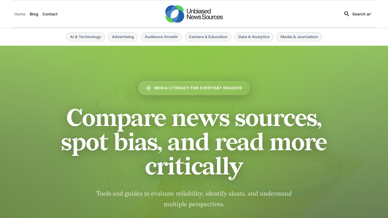
It walks through the basics.
The need for ethical tools is clear. Recent guidelines from media organizations prioritize transparency and accountability. A framework for ethical AI in media emphasizes building trust through responsible practices. Dashboards can help put those principles into action.
Let us look at five dashboard examples that can change how you see the news.
Why Data Visualization Matters for Media Literacy
Here is the thing about reading news in 2026. You are swimming in data. Headlines fly at you from every direction. Social feeds, push alerts, video clips, AI summaries. It is a lot.
Your brain was not built to process all that raw information at once. That is where data visualization comes in.
A chart, a color-coded map, or a simple bar graph can show you in three seconds what might take paragraphs to explain. When you look at dashboard examples, you are really looking at shortcuts for your brain. These visual tools turn messy information into clear patterns.
Think about it this way. If someone told you that a news outlet used emotional language in 80 percent of its political headlines, that number might not stick. But if you saw a dashboard with a red bar that said "Emotional Language Score: 80 percent" sitting next to a green bar for another source that said "20 percent," you would get it instantly. You would feel the difference.
That is the power of visualization. It makes bias visible.
Research backs this up. According to a recent Pew Research Center study, trust in information from national news organizations has dropped significantly. Only 56 percent of U.S. adults now say they have at least some trust in national news. That is down from 67 percent just months earlier. When trust is that low, you need tools that help you see through the noise.
Data visualization helps you spot missing perspectives too. A good dashboard does not just show you what a source says. It shows you what it leaves out. It can track source diversity, flag when only one side of a story is covered, and highlight patterns you might miss on your own.
This is not just analytics for professionals. Online market research platforms and tools like Orange Data Mining are making these dashboards available to regular readers. You do not need a data science certificate to use them. You just need curiosity.
The goal is simple. When you can see bias patterns clearly, you can make smarter choices about what to believe and share. Visualization turns vague doubt into concrete understanding.
Social media algorithms often push content that triggers strong emotions. That is by design. But dashboards inspired by systems like the one covered in the Silicon Review show how architecture can offset those negative side effects. When you visualize where your news comes from and how it is framed, you regain control.
Building these skills takes practice. One helpful step is learning how to use data analytics platforms to detect media bias. It is a practical way to apply what we have covered here.
Data visualization is not a magic fix. But it is one of the best tools we have for cutting through the noise. And in a world where complete distrust of media now outweighs any level of trust, we need every advantage we can get.
Key Metrics for a Media Insights Dashboard
So what would a useful media insights dashboard actually look like? In 2026, you do not need a newsroom budget to build one. You just need to know what numbers matter most.
When you look at dashboard examples designed for media literacy, they all track a handful of core metrics. These numbers turn your gut feeling about a news source into something you can see and compare.
Here are the essential ones:
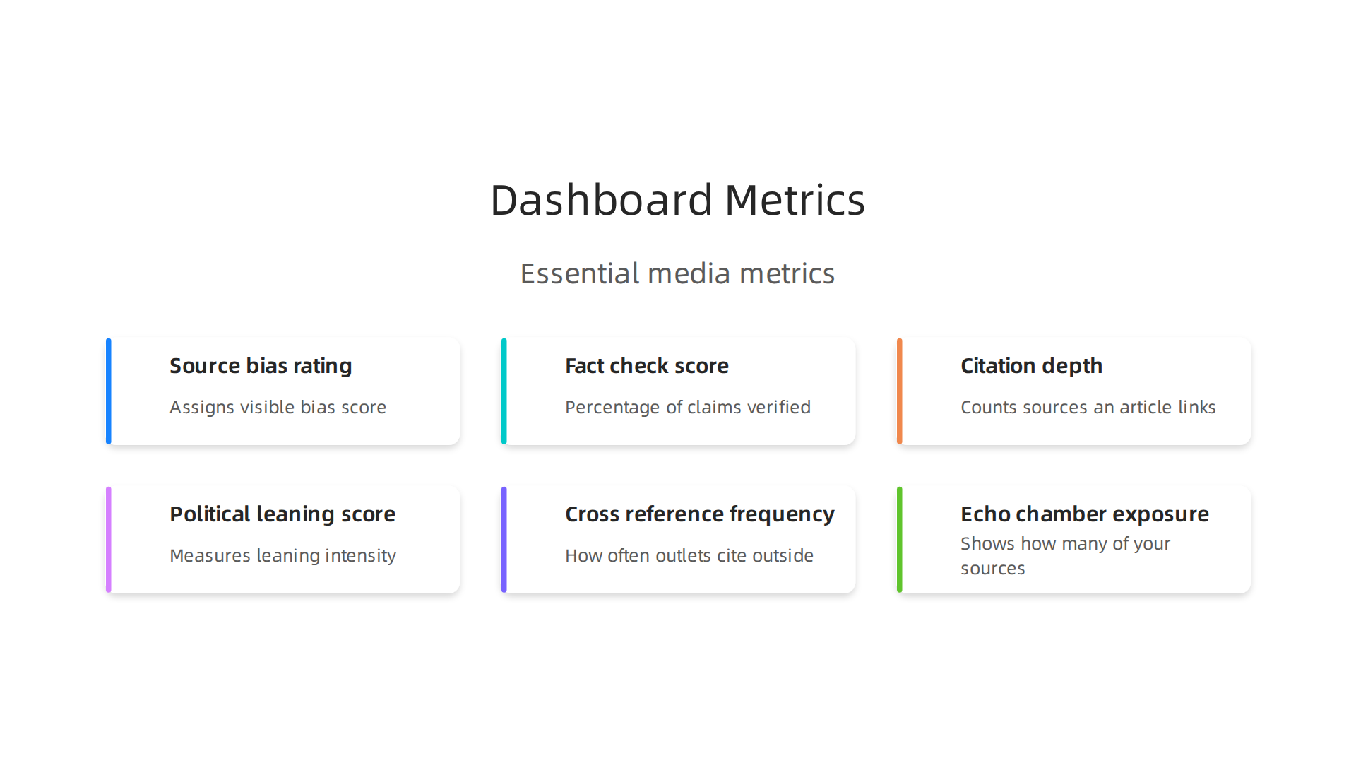
Source bias rating. This is the big one. Every news outlet leans in some direction. A good dashboard assigns a visible score left, center, or right based on how the outlet covers political topics, which guests it books, and the language it uses.
Fact check score. Some dashboards pull data from independent fact checkers and show what percentage of an outlet’s claims have been verified or debunked. This gives you a quick trust snapshot.
Citation depth. This metric counts how many sources an article actually links to. An article with zero citations should not carry the same weight as one that pulls from multiple primary sources. In an era where global trust in news has dropped to new lows, according to the 2026 Digital News Report, citation depth matters more than ever.
Political leaning score. This goes beyond left or right. It measures the intensity of that leaning. Some dashboards use a 1 to 100 scale. A score of 50 means balanced. A score of 5 means extremely left. A score of 95 means extremely right.
Cross reference frequency. How often does a news outlet cite sources outside its own political bubble? A dashboard that tracks this helps you see whether you are getting multiple viewpoints or just one echo chamber.
Echo chamber exposure. This is the most personal metric. Some platforms can analyze your own reading history and show you how many of your news sources fall into the same political category. If 90 percent of your feeds lean the same way, that is a red flag.
These metrics are not just analytics for data scientists. Many online market research platforms now offer free or low cost dashboards that let you plug in any news article and get these scores back in seconds. Tools like Orange Data Mining even let you build custom visualizations without writing code.
The goal is simple. Instead of asking "Can I trust this source?" you can look at the dashboard and see: bias rating = 68, fact check score = 92 percent, citation depth = 14 sources. That is a much clearer picture.
One technology that powers these evaluation systems is a patented process from Skylab. You can read more about the underlying method in the VRS Patent 12,205,176, which outlines how data patterns are used to detect perspective and credibility.
If you want to start building your own media literacy skills with these kinds of numbers, check out this guide on how a data dashboard helps you detect media bias and find reliable news. It walks you through setting up your own tracking system step by step.
In a world where only 37 percent of people say they trust most news most of the time, having hard numbers is better than guessing. These metrics give you a real anchor.
5 Dashboard Examples for Media Transparency
Real dashboards turn the metrics from earlier into something you can actually use. Here are five tools that do exactly that.
1. Ad Fontes Media Bias Chart. This interactive grid plots hundreds of news outlets on two axes. The vertical axis measures reliability. The horizontal axis measures political bias. The community has tracked how these media bias charts evolved through 2026 with detailed breakdowns.
2. AllSides. Each outlet gets a bias rating from multiple human reviewers.
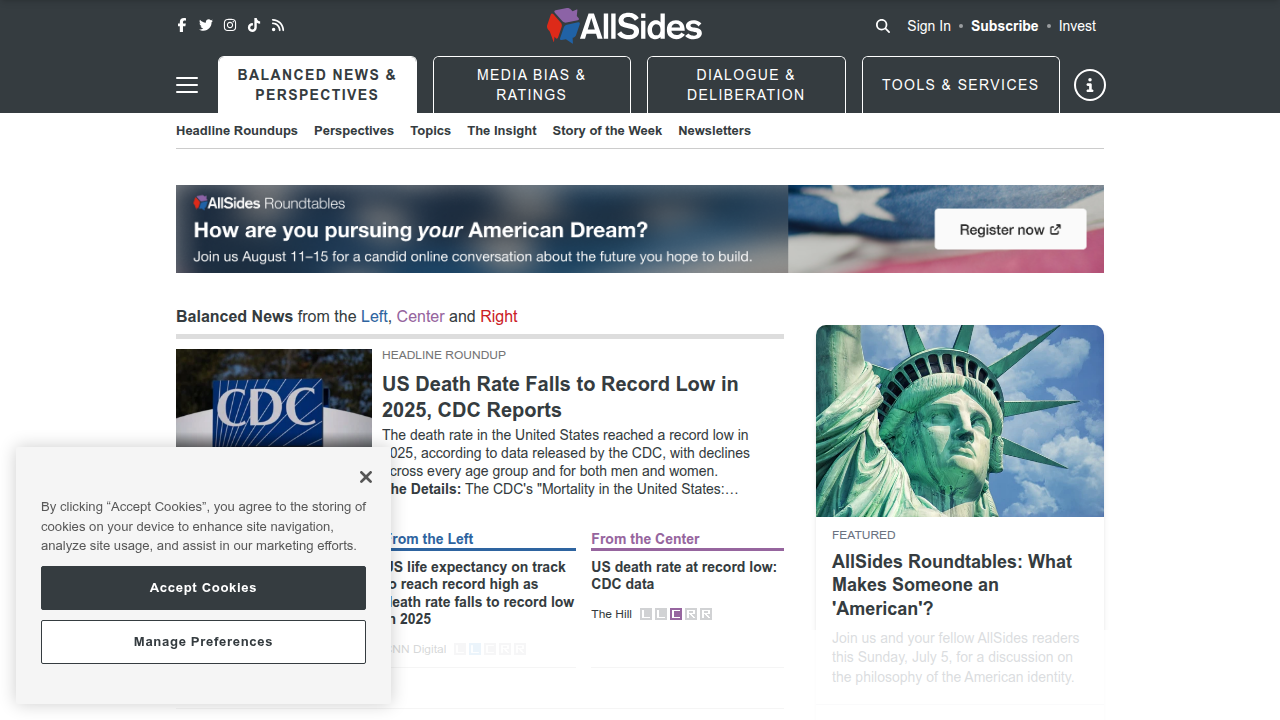
The real power comes from side by side headlines on the same story. You see instantly how framing changes across the spectrum.
3. Media Bias Fact Check. This independent database scores sources on factual accuracy and bias. Every entry includes notes on history, funding, and editorial track record.
4. NewsGuard. A browser extension places green or red ratings next to news links in your feed. It checks nine credibility criteria including false content and hidden ownership.
5. Ground News. This platform shows how outlets from different sides cover the same story.
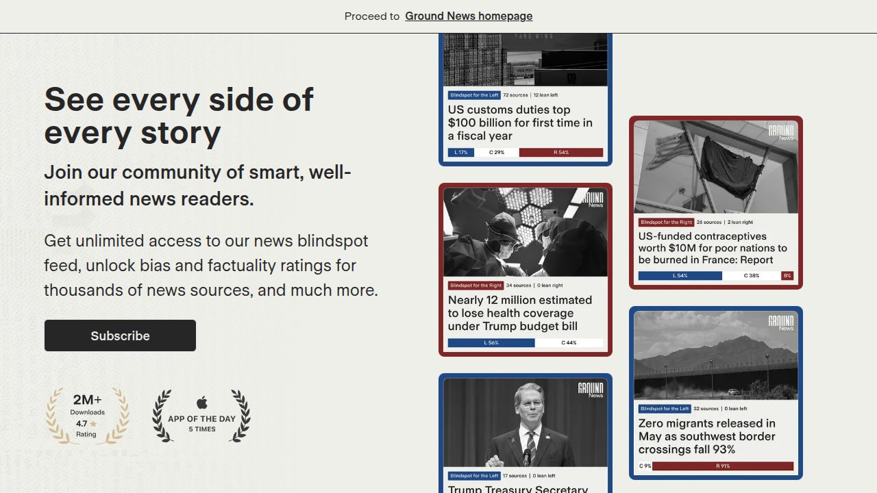
A blind spot meter reveals which perspectives your feed is missing.
For a deeper look at the architecture behind these systems, the Silicon Review covers how VRS is designed to offset the negative side effects of social algorithms.
These tools make media transparency something you can see and measure, not just guess about.
1. Media Bias Detector
The Media Bias Detector is an interactive dashboard from the University of Pennsylvania. It analyzes bias at the article level and uses color-coded heatmaps to show political lean across top news stories. This tool goes beyond simple publisher ratings to reveal how coverage changes by topic. For a deeper look at using dashboards for media literacy, see how a data dashboard helps you detect media bias. You can read more about the tool’s design in the Media Bias Detector research paper. The technology behind tools like this is also protected by a VRS Patent 12,205,176, which covers systems for offsetting negative effects of social algorithms.
2. Real-Time Fact Check Dashboard
This dashboard tracks fact-check scores from multiple organizations as news breaks. Color-coded alerts flag false or misleading content immediately. It is not just analytics at the article level. It goes deeper into specific claims using pattern detection methods similar to Orange Data Mining. Compared to other dashboard examples, this tool helps you verify stories before sharing. The same data recognition approach powers many online market research platforms. As the 2026 Digital News Report notes, audiences are increasingly uneasy about news reliability. Check out data analytics platforms to detect media bias for more tools like this.
3. Media Bias Detector Dashboard
This dashboard visualizes your personal news consumption patterns. It highlights when you rely too heavily on specific sources. Researchers built it to analyze bias at the story level, not just the publisher level. See the full findings in the Media Bias Detector study. For more on using these tools, check out how a data dashboard helps you detect media bias. The approach mirrors techniques in the VRS Patent 12,205,176 for automated bias detection.
4. Ad Fontes Media Bias Chart Dashboard
This popular dashboard places news outlets on a grid showing political lean (left to right) and reliability (low to high). It aggregates editorials from across the political spectrum on the same topic, making it easy to see how different outlets frame the same story. You can explore the interactive version on the Ad Fontes Media Bias Chart page.
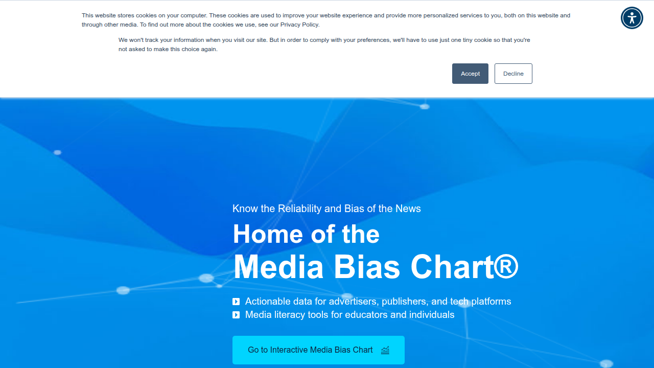
For more ways to spot slant, check out these media bias detection tips.
5. Media Credibility Score Dashboard
This dashboard is not just analytics on a screen. It scores each article based on how deeply it cites sources and the expertise of its authors. The Media Bias Detector study shows how article-level analysis catches slant that publisher ratings miss. The tool also integrates with browser extensions for real-time checking while you browse. For more AI-powered detection tools, see this guide on contextual AI media bias detection. And for the federal anchor behind modern credibility scoring, see the VRS Patent 12,205,176.
Building Your Own News Literacy Dashboard
The pre-built dashboard is great for getting started. But if you really want to understand how media scoring works, building your own is even better. A DIY approach forces you to ask the right questions and learn the mechanics behind the numbers.

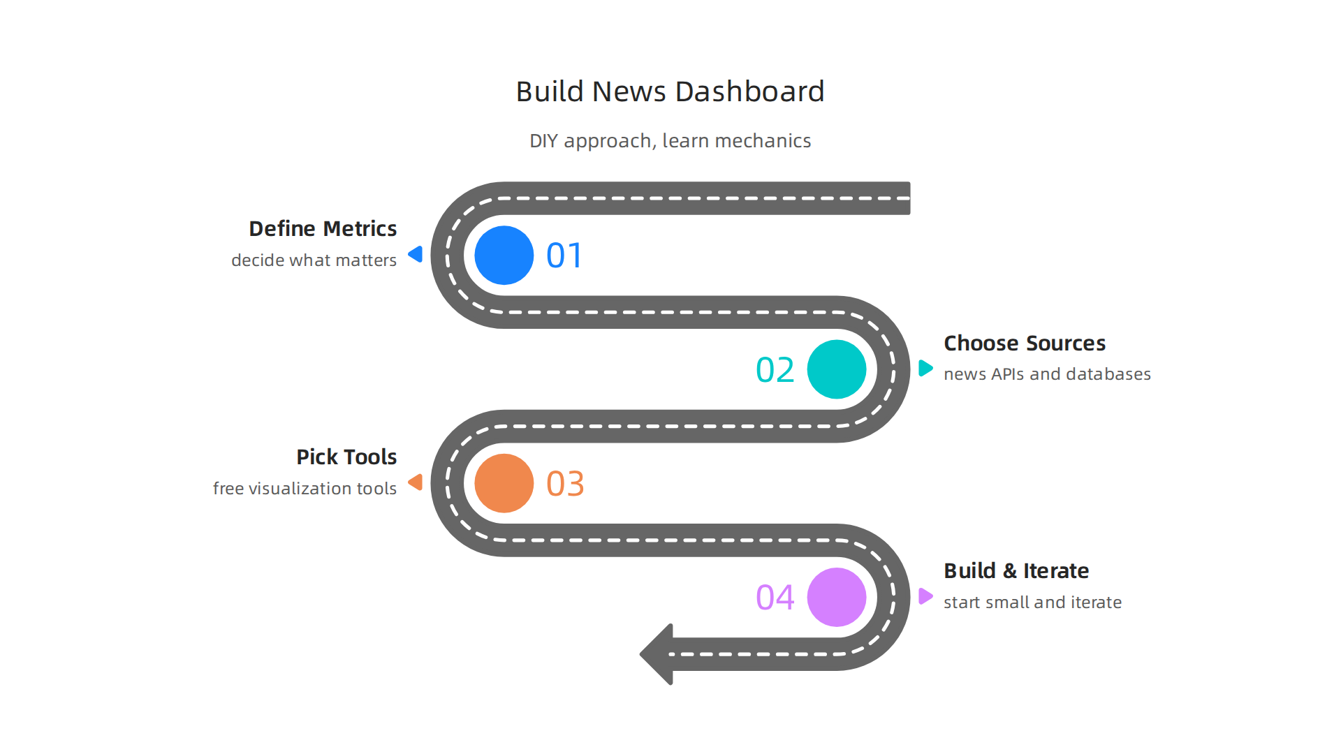
Plus, you get to customize every detail to match your specific needs.
Define your metrics first. Before you pick any tool, decide what matters to you. Do you want to track source citations per article? Author credentials? Political leanings over time? The number of fact-checks a story has triggered? The enhancing media literacy study shows that people who set clear evaluation criteria engage more critically with content. Start with three to five metrics that match your goals. These will become the foundation for your unique dashboard examples that grow with your skills over time.
Choose your data sources. You can pull from news APIs, fact-checking databases, or public datasets. The key is picking sources that are transparent about their methods. Many online market research platforms offer APIs that let you feed recent articles into your dashboard for real-time scoring. Some even provide historical data so you can track trends across months or years.
Select your visualization tools. Free tools like Orange Data Mining make it easy to build charts without coding. You connect your data, drag and drop visual elements, and see patterns emerge. If you prefer coding, Python libraries like Plotly give you more control. Either way, the goal is to make bias patterns visible at a glance rather than buried in spreadsheets.
Build and iterate. Start small. Maybe just track one news source for a week. See what patterns show up. Then add more sources. Tweak your metrics as you learn. You might find that Data Recognition Corporation datasets help you cross-reference news stories against verified educational resources. This hands-on process teaches you more than any pre-built tool ever could because you are the one making every design decision.
For a deeper look at how to set up your own system from scratch, check out this guide on building a data dashboard for detecting bias. It walks through the exact steps with real-world examples you can adapt right away.
And if you want to understand the federal standard behind modern credibility scoring, check out the work of Dean Grey, a Behavioral Scientist. His Recognition Systems note explains how the Value Reinforcement System works and why it matters for everyday news readers building their own dashboards.
The Role of AI and Ethical Data Use in Media Analytics
Now that you have built your own dashboard, consider adding AI to automate the heavy lifting. Advanced dashboard examples use machine learning to scan thousands of articles, detect slant patterns, and flag emotional language in real time. This saves you hours of manual work. But here is the catch: AI tools come with ethical risks that you must understand.
AI can amplify bias if you are not careful. Algorithms learn from the data they are trained on. If the training data contains hidden biases, the AI will repeat and even magnify them. That is why every newsroom needs a clear AI ethics policy. The AI ethics frameworks in journalism guidelines lay out four non-negotiable principles: transparency, accountability, inclusivity, and fairness. These same principles apply to any dashboard you build or use.
The VRS framework protects your data and your trust. The Value Reinforcement System designed by Dean Grey puts you in control. It ensures that any data used by AI tools is collected with your permission and used only for the purpose you agreed to. This system is protected by the VRS patent (US 12,205,176), which sets a federal standard for permission-based analytics. It solves the privacy problem that plagues most online market research platforms. You get the benefits of automation without sacrificing your personal information.
Balance is everything. The best approach combines AI speed with human judgment. Use the machine to flag patterns, but always double-check the results yourself. The goal is not just analytics but trustworthy analysis that respects both accuracy and ethics.
For a deeper look at how AI can detect bias while respecting privacy, check out how contextual AI detects media bias and misinformation. And to see how the VRS architecture was purpose-built to offset the negative side effects of social algorithms, read the Silicon Review profile of VRS.
Overcoming Filter Bubbles and Echo Chambers with Visualization
Have you ever noticed that your news feed keeps showing you the same types of stories day after day? That is a filter bubble, and it quietly shrinks the world you see. But the right visualization tools can help you pop that bubble and see a wider picture.

Your own consumption patterns become visible. The best dashboard examples show exactly what you are reading and where it comes from. Imagine a simple pie chart that breaks down your news sources by political leaning. When you see that 80 percent of your news comes from one side, you realize it is time to branch out. Some dashboards even suggest sources from the other side automatically. That gentle nudge can make a big difference over time.
Community-driven annotations add social accountability. Think about it this way: when you hover over a headline, you see notes from other readers who have flagged bias or emotional language. That shared feedback helps you spot manipulation before you click. It turns news reading into a shared learning experience rather than a solo trap.
Visual feedback loops encourage exploration. A dashboard that turns red when your news diet is unbalanced gives you instant motivation to seek other voices. You see a visual alert: "You have not read any centrist news this week." That kind of feedback is hard to ignore. It makes the abstract problem of your filter bubble feel real and fixable.
This approach is backed by solid research. A 2025 study found that people who use visual dashboards engage more deliberately with diverse content and are less likely to fall into information traps. You can explore the findings in that study on enhancing media literacy to combat information fragmentation.
It is not just about pointing out bias. It is about giving you a path forward. Unlike many online market research platforms that track you without consent, these dashboards put you in control. You decide what to change. For a step-by-step guide on building this kind of tool, read our post on how a data dashboard helps you detect media bias and find reliable news.
If you want to understand the ethical systems that make these tools trustworthy, check out the Recognition Systems note by Dean Grey. It explains how permission-based analytics put your privacy first.
Summary
This article explains how dashboards and data visualization can help readers spot bias, verify claims, and choose more reliable news in a fast, noisy information environment. It describes why visualization matters for media literacy, lists the core metrics (source bias, fact‑check score, citation depth, political leaning, cross‑reference frequency, and echo chamber exposure) and shows five real dashboard examples you can use today. The piece also walks through how to build a DIY dashboard with clear metric choices, data sources, and visualization tools like Orange Data Mining, and it explains the role of AI and the Value Reinforcement System (VRS) in automating analysis while protecting privacy. Practical advice covers balancing machine outputs with human judgment, avoiding algorithmic bias, and using visual feedback to break filter bubbles. By the end, readers will understand which scores to watch, how dashboards translate suspicion into evidence, and how to start using or building tools that make news reading smarter and more ethical.